Burnup chart is used to show how many story points are in the product backlog versus how many we’ve completed till date, as well as how much work remaining in the project (Not on Sprint level but at project level). In other words it displays the scope of a project and the work completed.
Burnup charts start at the bottom left corner, & begin to track time on the X-axis and track progress on the Y axis, moving in an upward diagonal direction as you complete User Story points.
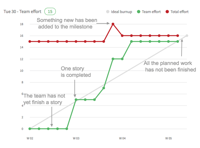
- Total effort or milestone line (RED) —the total effort required to achieve the team’s goal (a sprint or release)
- Team effort or work completed line (GREEN) —the team’s progress toward the goal, over a given period (typically story points completed)
- Ideal line (GRAY) —the ideal work pace needed to meet the project’s deadline
It is an effective tool for communicating to the project stakeholders and clients how the extra feature requests they are asking for will affect the deadline, and at the same time for reassuring them that good progress is being made.In a project where clients are adding a lot of work mid-project, a Burndown chart will not be an accurate reflection of the project teams output, and could lead to performance questions from the client. A Burnup chart can quickly make clients re-evaluate whether they really need that extra bell or whistle.
Burnup vs Burndown Chart
A Burndown chart shows the amount of work remaining on a project (the remaining effort), whereas a Burnup chart shows how much work has been completed and the total scope of the project. In a Burndown chart, the line goes from top to bottom as a team makes progress, while in a Burnup chart the line climbs from the bottom upwards. Both charts use the same axies.
Release Burnup Chart
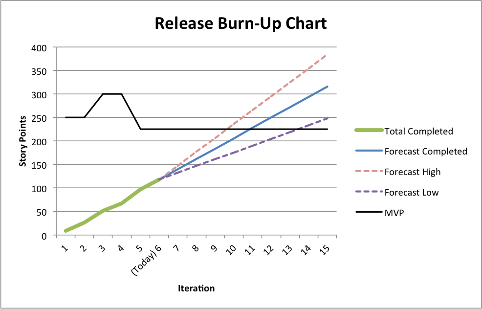
- Horizontal (X) Axis – Amount of Time (in sprints)
- Vertical (Y) Axis – Remaining Amount of Work (in points)
- Black Line – Total points; the overall scope of the project over time.
- Green Line – Completed points; the team’s progress towards their goal over time.
- Blue Line – The ideal pace needed to meet the deadline.
- Orange & Purple Dotted Line – A high and low projection of likely future progress, based on historical velocity data. (Optional)
Advantages of Burnup Charts on Burndown Charts
The problem is that burndown charts lack two essential pieces of information. First, how much work was actually accomplished during a given iteration (as opposed to how much work remains to be completed) and second how much total work the project contains (or if you prefer how much scope has increased each iteration). Also because a burn-down chart only has one line, changes made to the scope of the project are not visible. Consider the following scenarios:
- Work is more than the planned work.
- A client suddenly demands extra features
In a burn-down chart, these changes to scope will be invisible and it will appear the team is getting less done. In a burn-up chart, you can clearly see the scope increase and the actual progress by the team. Brun-up chart helps in identifying dramatic increase in the scope (Scope Creep) of a project. A product owner or customer can reduce the work, or alternatively a team can adjust their sprint and release plan.
Burnup charts allows to divide the scope and the progress whereas, in the Burndown it is combined and it doesn’t allow to visualize and identify changes in scope and/or progress. These changes will appear at the top of the chart when a team makes changes to the budget or scope.
- Total scope variability from feature additions and cuts.
- Team velocity variability from inherent uncertainty of feature complexity, interruptions, or burnout.
- Future projection variability, transparently illustrating the range of potential end scenarios given velocity variability.